
5 Ways To Present Data To People Who Are Scared of Numbers
2 July 2021
Do you or someone in your team suffer from arithmophobia? As you might be able to guess, it’s an irrational fear of numbers.
I often meet people that love numbers; they love spreadsheets, metrics, analytics and management ratios. But there is another (often considerably larger) proportion of people that don’t really like numbers, don’t like discussing them, and in some cases are actually phobic of dealing with them.
And the problem is more common than you might think. One study found that six out of ten university students suffered from diagnosable maths anxiety.
And while you’re not likely to face an algebra pop quiz once you’ve left school, a phobia of numbers persists and can be a major problem in the workplace if management information is circulated in spreadsheets full of numbers.
What do you do, then, if you are the person in charge of compiling and distributing — let alone explaining — those dreaded spreadsheets?
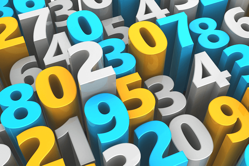
Become better at visualisations
What we need to do is to better translate the numbers into headlines, narratives and visuals that better speak to people who don’t like numbers and don’t want to analyse numbers.
To do that, we need to become better at constructing visual representations of those numbers. The goal of any analytics is not to be the person with the most data, but to be the person whose data is understood.
Different people process data in different ways, regardless of whether numbers flummox them or not. Different visualisation methods can help with this, but so does considering your audience and your subject.
Some subjects naturally lend themselves better to tables, or graphs, or even infographics. Some audiences will fall asleep the first time they see a table in a presentation, but might wake up and pay attention if a graph were animated to show change over time.
No matter what your subject or who your audience, getting feedback is essential. At heart, data is a story, and you have to find the best way to tell it.
5 ways to improve your visualisations
There are some tools and strategies that can help you create better visualisations and help everyone in your audience — arithmophobia or not — understand the data.
1. Use benchmarks. Instead of just laying out the numbers, consider including a benchmark, like percent change, so that people can easily see the difference between two large numbers.
2. Use colour. Colour can pass along a message more easily than numbers in some cases. For example, if you use red for a negative percent change and green for a positive percent change, viewers will be able to quickly and easily see the difference.
3. Use pictures or metaphors. Simple graphics like smiling or frowning faces, pluses and minuses, check marks, or even weather (sunny, cloudy, stormy) can convey positive and negative change and help the audience relate to the numbers.
4. Use motion or animation. If you are working in a format (like a digital presentation) that allows animation, it can be a wonderful tool for demonstrating change over time. Don’t get caught up in animation just because it looks cool, though; make sure you’re using it appropriately to convey a message.
5. Use words and word clouds. If you can easily explain the meaning of a set of numbers in words, do so. You never know how your audience will best receive information. Word clouds are also a wonderful way of visualising certain kinds of data.
A word about infographics. Infographics are usually a combination of many types of data visualisation in a cohesive whole, and while infographics are certainly the trendiest way to visualise data, they may not always be the best way. An infographic that beautifully and interestingly conveys complex data would be excellent for an important presentation, year-end report, or website, but if you’re just sending along monthly numbers, you probably don’t have time for this kind of complicated graphic design.
Do you deal with number or maths anxiety at work? Or are you the person who has to make numbers friendly for the team? What visualisation strategies work best for you? I’d love to hear your ideas in the comments below.
Related Articles

The AI Trap More Companies Will Fall Into In 2026
By now, “smart” versions exist of just about every home appliance, gadget and gizmos we can think of. However, manufacturers continue[...]

Why AI Is A Game-Changer For Creatives, And Why The Creative Industries Must Fight For Their Rights
By now, “smart” versions exist of just about every home appliance, gadget and gizmos we can think of. However, manufacturers continue[...]

How AI Is Rewiring Filmmaking, And Why Craft Still Wins
By now, “smart” versions exist of just about every home appliance, gadget and gizmos we can think of. However, manufacturers continue[...]

Why Threat Intelligence Is Becoming A Must Have In Fraud Prevention
By now, “smart” versions exist of just about every home appliance, gadget and gizmos we can think of. However, manufacturers continue[...]

Why Prompt Engineering Isn’t The Most Valuable AI Skill In 2026
By now, “smart” versions exist of just about every home appliance, gadget and gizmos we can think of. However, manufacturers continue[...]

What I Learned At Cisco’s AI Summit, And Why It Changed How I Think About The Next 12 Months
By now, “smart” versions exist of just about every home appliance, gadget and gizmos we can think of. However, manufacturers continue[...]

Sign up to Stay in Touch!
Bernard Marr is a world-renowned futurist, influencer and thought leader in the fields of business and technology, with a passion for using technology for the good of humanity.
He is a best-selling author of over 20 books, writes a regular column for Forbes and advises and coaches many of the world’s best-known organisations.
He has a combined following of 4 million people across his social media channels and newsletters and was ranked by LinkedIn as one of the top 5 business influencers in the world.
Bernard’s latest book is ‘Generative AI in Practice’.
Social Media