The 3 Biggest Performance Reporting Mistakes – And How to Fix Them
2 July 2021
In my experience, lots of performance reporting is done poorly. From small startups to huge corporations, there are certain mistakes companies make time and time again when reporting on performance.
In this article, we’ll take a look at the three biggest mistakes I commonly see, and I’ll share my suggestions for making your performance reporting more effective.

Where performance reporting goes wrong
Nowadays, there are so many different ways to report on performance: simple charts, written reports, spreadsheets, commercial data visualisation platforms that make the data look interesting and attractive, or complex management dashboards that provide your people with the information they need whenever they need it.
Regardless of the method used for performance reporting, I still tend to see the same three mistakes crop up. They are:
1. Too much detail. You’ve probably been on the receiving end of complicated graphs that no one understands, or lengthy reports that no one reads in any depth. I know I have. It may look impressive, being able to report in such great detail, but if nobody understands (or can be bothered to sift through) the information, what’s the point?
2. Too many metrics. Likewise with a complex dashboard or spreadsheet reporting on dozens of different metrics at a time – the temptation is to give up due to information overload, or get bogged down in tiny details that don’t really matter.
3. Not enough insights. Performance reporting is so often focused on presenting metrics and data, rather than highlighting critical insights that will help to drive future performance. Or if the insights are there, they’re usually hidden by all the detail. When key insights are hidden (or missing altogether), how can anyone act on them?
Rethinking performance reporting
I believe we need to move away from reporting details to reporting insights. We need to turn data and metrics into insights that will help people understand and improve business performance.
The goal of any performance reporting should be to help people in the business interpret key data so that they can make smarter, more informed decisions. This means it should be as easy as possible for people to extract and understand the insights. The easier it is to understand key insights, the easier it is for people to make better decisions and act on that data.
Think of a newspaper’s front page
For me, a newspaper front page provides the perfect example of how to successfully deliver insights. Fair enough, not so many of us buy print newspapers these days, but we can all picture the typical format of a front page, with its bold headline, eye-catching image and (depending on the paper) informative narrative.
You walk past a stack of newspapers in the train station and what’s the first thing that catches your eye on the front page? (Assuming you have torn your eyes away from your phone, of course!) It’s the headline. This short, snappy description of the story is designed to grab your attention and make you want to find out more. Then there’s typically a strong picture that puts the headline into context and adds interest. And underneath the picture, you’ll find a brief narrative that introduces the story and presents the key facts.
A sure-fire way to present insights effectively
When I work with companies to improve their performance reporting, I always encourage them to present insights as a newspaper would. My tried-and-trusted format for performance reporting is therefore:
1. Start with a headline. Include an interesting and informative headline that explains what the data means and summarises the main finding. Typically, a company is measuring performance in order to answer business-critical questions (for instance, ‘Which traits do our top performers share?’), so it’s a good idea to use a headline that reaffirms the question you were trying to answer.
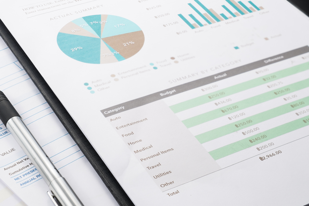
2. Include a useful visual. I’m not talking about paparazzi shots of celebs on holiday, but something that conveys the key bits of information in one handy image. Visuals are great for conveying information because they’re quick and direct, they’re easy to understand, they’re memorable, they add interest, and they’re much more likely to hold the reader’s attention than a full page of text. Depending on the information, this could be anything from a simple chart or traffic light visual to a snazzy infographic. Use colour where you can (again, traffic lights are great for this), but don’t get caught up in style over substance.
3. Add a short narrative. Narrative is also important because, without it, people can interpret the data differently. With a short narrative you can ensure everyone understands the data in the same way. Therefore, it’s always a good idea to include a short, simple narrative that supports the visual, explains the context behind the information and highlights key messages that should support decisions and action.
It’s the combination of visuals and narrative that’s far more powerful than using either on their own. For example, a graph detailing sales history is fine for analysing trends over time, but a supporting narrative can pull out the key messages and put that information into context – such as, explaining what’s behind that trend.
Using both visuals and narrative, summed up by an interesting headline, ensures that your people can easily pull out the critical insights and use them to inform their decision making. That, after all, is the whole point of measuring performance in the first place.
Related Articles
How AI Is Rewiring Filmmaking, And Why Craft Still Wins
By now, “smart” versions exist of just about every home appliance, gadget and gizmos we can think of. However, manufacturers continue[...]
Why Threat Intelligence Is Becoming A Must Have In Fraud Prevention
By now, “smart” versions exist of just about every home appliance, gadget and gizmos we can think of. However, manufacturers continue[...]
Why Prompt Engineering Isn’t The Most Valuable AI Skill In 2026
By now, “smart” versions exist of just about every home appliance, gadget and gizmos we can think of. However, manufacturers continue[...]
What I Learned At Cisco’s AI Summit, And Why It Changed How I Think About The Next 12 Months
By now, “smart” versions exist of just about every home appliance, gadget and gizmos we can think of. However, manufacturers continue[...]
Why CES 2026 Signals The End Of ‘AI As A Tool’
By now, “smart” versions exist of just about every home appliance, gadget and gizmos we can think of. However, manufacturers continue[...]
AI Agents Lead The 8 Tech Trends Transforming Enterprise In 2026
By now, “smart” versions exist of just about every home appliance, gadget and gizmos we can think of. However, manufacturers continue[...]
Sign up to Stay in Touch!
Bernard Marr is a world-renowned futurist, influencer and thought leader in the fields of business and technology, with a passion for using technology for the good of humanity.
He is a best-selling author of over 20 books, writes a regular column for Forbes and advises and coaches many of the world’s best-known organisations.
He has a combined following of 4 million people across his social media channels and newsletters and was ranked by LinkedIn as one of the top 5 business influencers in the world.
Bernard’s latest book is ‘Generative AI in Practice’.


Social Media