Why You Shouldn’t Use Pie Charts In Your Dashboards And Performance Reports
2 July 2021
Pie charts are one of the most overused graphs in the world and in most cases are not the best way to present data. They often distort the information and make it more difficult for decision-makers to understand the messages they contain.
Okay, they are not really evil but I’d go so far as to say that in the vast majority of cases the pie deserves to be banned from the boardroom. (Unless it’s the edible variety.)
If you’re interested in making better presentations, reports and dashboards, then one simple way is to eliminate pie charts from your repertoire. Here’s why.
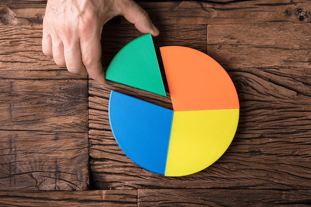
Why do we use charts and graphs in the first place?
The reason we put charts and graphs in our reports and presentations is to present information in a way that’s easier to understand.
In general, charts and graphs should make data easier to understand, make it easier to compare different data sets, and do it all without increasing the complexity of what’s being presented.
Pie charts stink at that.
It’s true! Except in very rare cases, pie charts are extremely bad at making data easier to understand, and especially bad at helping us compare different data sets.
One of the only good use of a pie chart is to show the relationship between parts or percentages of a whole. Children learn fractions by imagining equal slices of a pie. But when the slices aren’t equal, as often is the case with real-world data, it’s difficult to envision the parts of a whole the pie chart was intended to facilitate.
Humans just naturally aren’t very good at distinguishing differences in slices of a circle, especially not at a glance; we’re much better equipped to notice differences in rectangular shapes. And, unless you’re especially spatially gifted, it’s also nearly impossible to compare similar slices from two different pie charts.
From a design point of view, a pie chart takes up far too much space to convey a set of data compared to other options. In addition, the labels don’t line up, so the result becomes cluttered and hard to read — strike three against pie charts, as they often make the data more complicated than before. Pie charts also don’t work well at various sizes. A small pie chart is all but useless, whereas a small bar graph or line graph can still easily show differences in data.
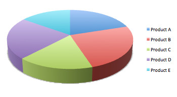
Finally, it’s much easier to distort the data on a pie chart than any other type. Because we’re already so bad at distinguishing between the different slices of the pie, if you tilt a pie chart or make it “3D,” as is so popular in many programs, you quickly make it even harder to read and distort your data even more.
So why are they so popular?
Ask any designer or statistician, and they will tell you that pie charts are terrible in almost any application. My data visualization heros Edward Tufte and Stephen Few have been preaching against pies for years. So why do we keep using them?
Personally, I think it’s because they look friendly and smart. What’s more, they are so easy to produce, it only takes a few clicks in any office application and you’ve got one. However, the truth is that in most cases they are not right and using them is a sign that we just haven’t taken the time to think about the best way to present our data.
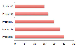
I regularly help my customers improve their board reports and corporate dashboards and pie-charts are usually the first things I take out. But what do I replace them with? That depends on the data and the information you want to communicate, but a horizontal bar graph will be a better choice than a pie chart in almost any situation.
Try This Instead.
If you still feel the urge to use them, make sure you only use them for a percentage breakdown where each slice represents a certain percentage out of 100% and order the slices in size to make it easier to read. Never use a pie chart if it has more than 5 slices and never-ever make it 3D.
But before you ever go ahead and stick a pie into any report or presentation, promise me to try a bar graph first and compare it to the pie chart – then pick the one that is easier to read and understand. This is what I have done in this little product sales breakdown example here. Which one tells you at a glance that Product D sold more than Product C, and that Product A is in 3rd place?
What do you think? Do you still love the pie chart or hate it? Are you with me in my anti-pie-chart movement? Let me know in the comments below.
Here are some other related posts I have written:
Related Articles
5 AI Agent Mistakes That Could Cost Businesses Millions
By now, “smart” versions exist of just about every home appliance, gadget and gizmos we can think of. However, manufacturers continue[...]
Build Or Buy AI Agents: Why This Choice Matters More Than You Think
By now, “smart” versions exist of just about every home appliance, gadget and gizmos we can think of. However, manufacturers continue[...]
Sign up to Stay in Touch!
Bernard Marr is a world-renowned futurist, influencer and thought leader in the fields of business and technology, with a passion for using technology for the good of humanity.
He is a best-selling author of over 20 books, writes a regular column for Forbes and advises and coaches many of the world’s best-known organisations.
He has a combined following of 4 million people across his social media channels and newsletters and was ranked by LinkedIn as one of the top 5 business influencers in the world.
Bernard’s latest book is ‘Generative AI in Practice’.





Social Media